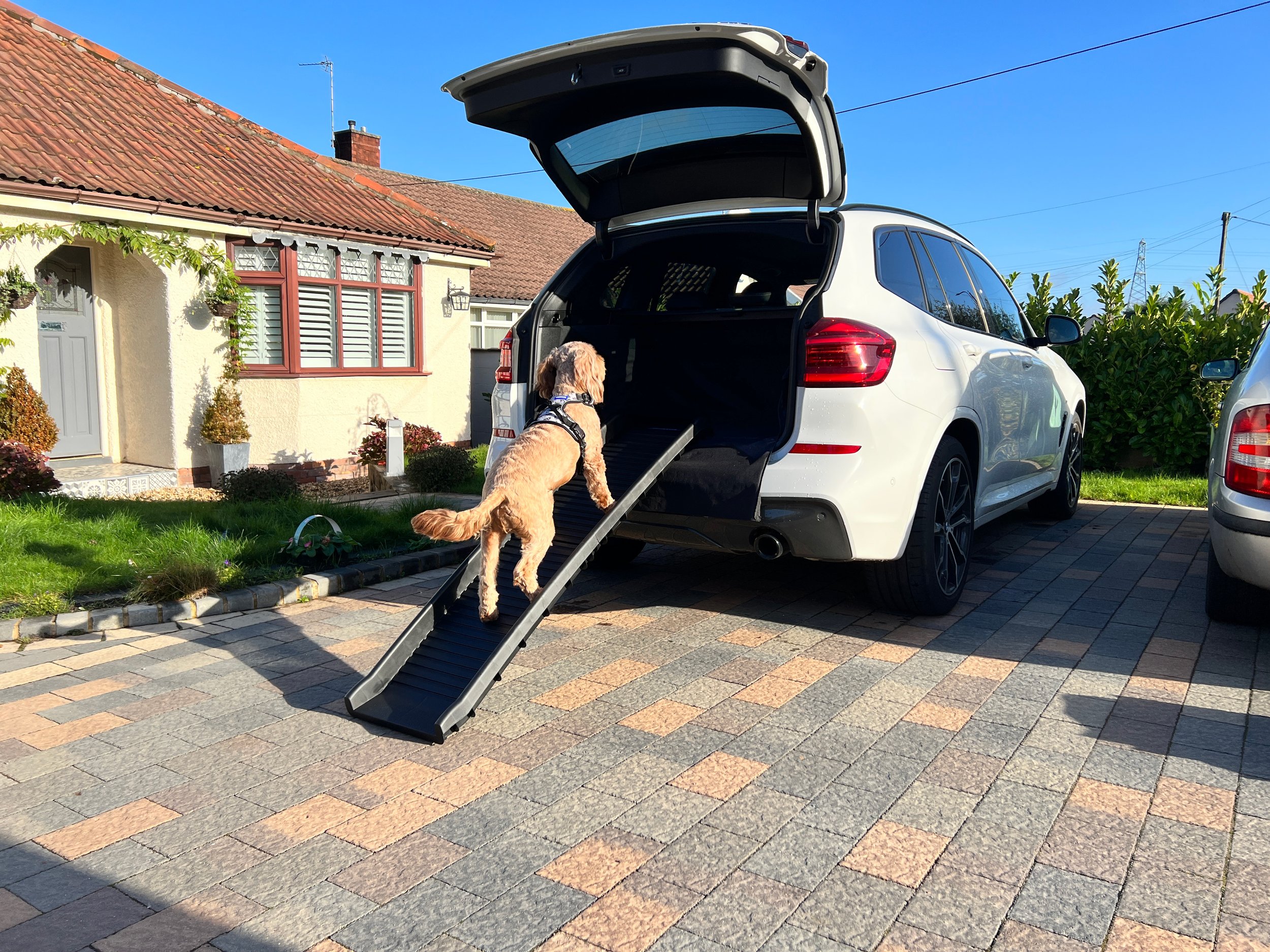
Battersea Dogs & Cats Home are one of the UK’s most well-known charities. They’ve been helping dogs and cats in need since 1860 with over 160 years of heritage. I had the great opportunity, whilst working at Saxon, to help bring a wide range of pet travel accessories to the market. This brand really excited me, as I’m a huge dog lover, and knowing that a percentage of all sales will go directly to the Battersea charity was very rewarding. From the moment I received the branding/assets I knew I had the potential to create some really strong concepts.
This project was a great opportunity for me to get involved with product development as well as packaging design, this meant that concept product design was key. Below are some of the initial product concepts that I designed and developed, of which a handful were selected to go into production and are due to go into market in 2023. Battersea had provided us with a vast amount of assets to really play around with, so it was up to me to find out what worked and what didn’t, following their brand guidelines. The main goal was to create a product that stood out from the rest of the market using the Battersea assets. I played around with every colour combination in their guidelines, applying different patterns, statements and textures, allowing us to see what combinations worked best for the brand.

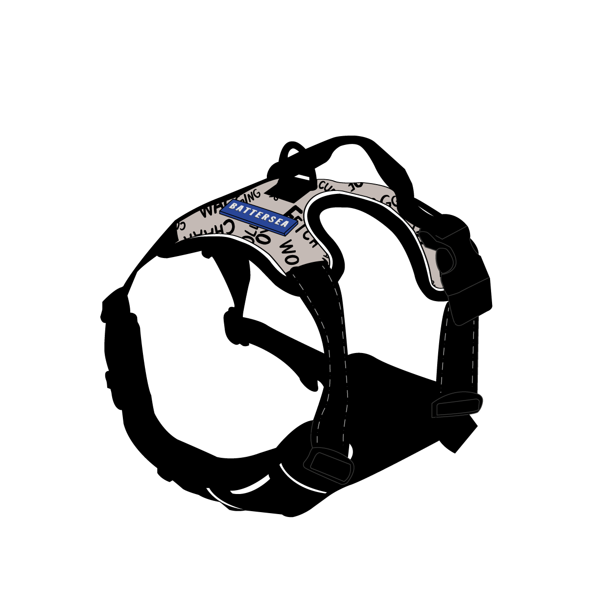


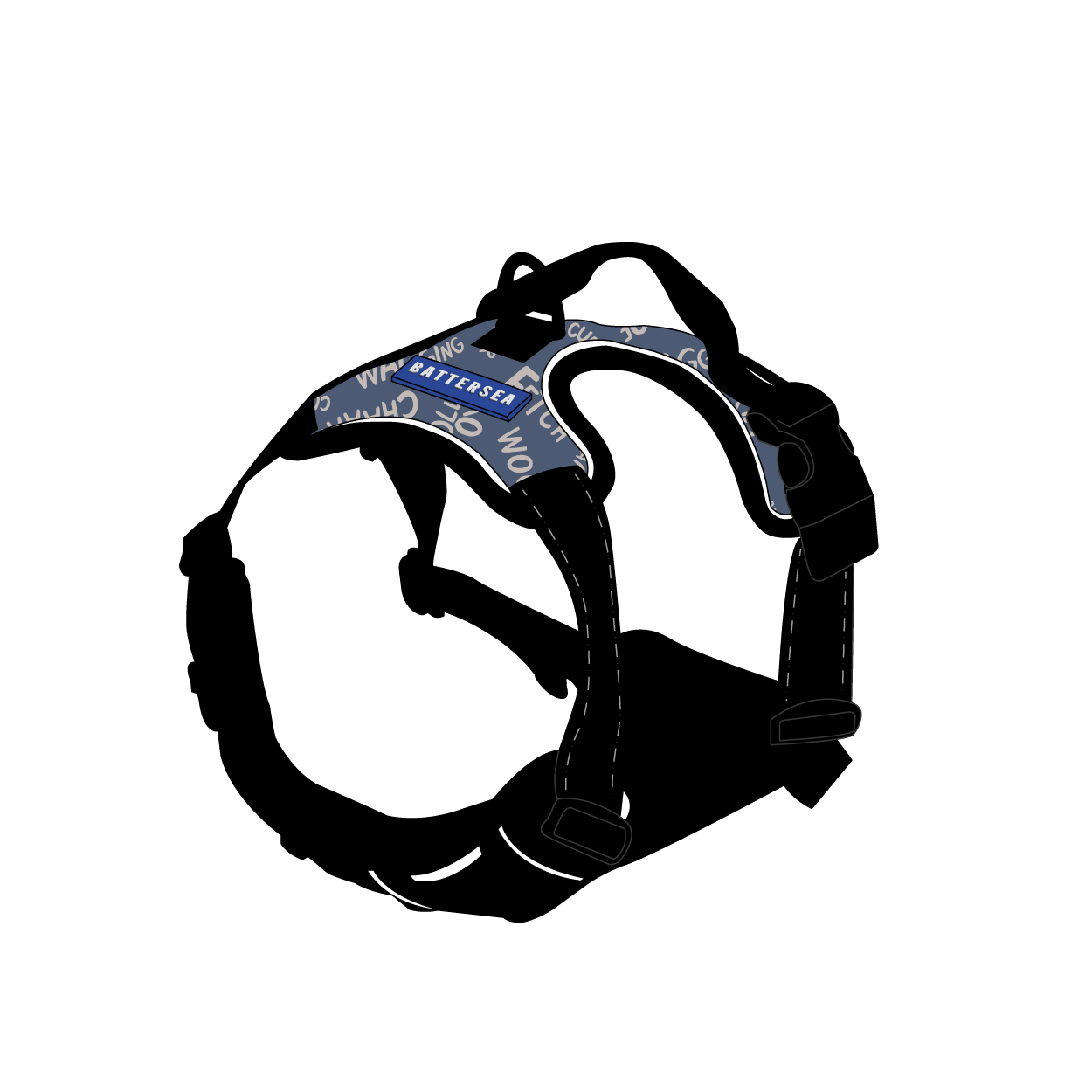


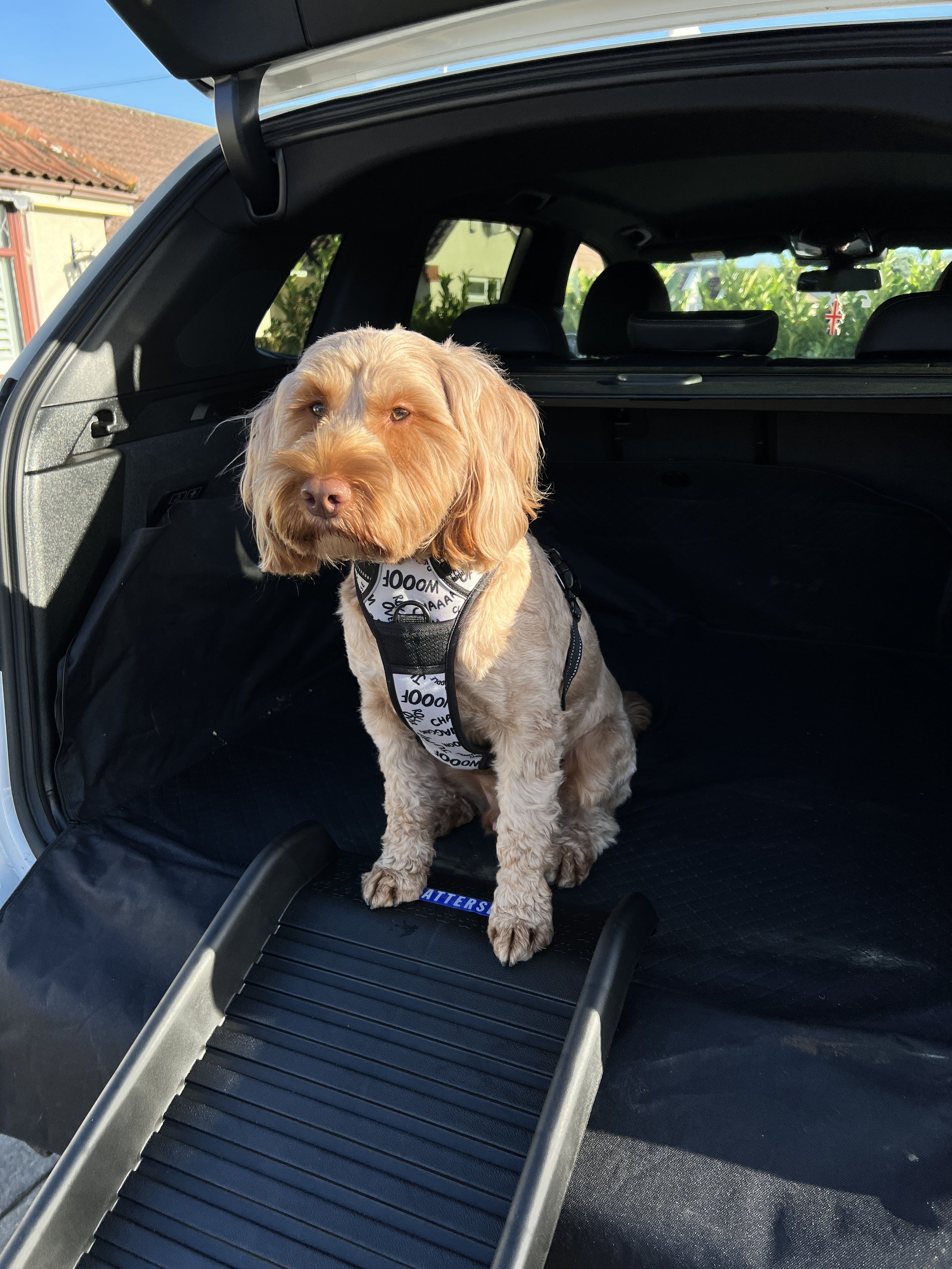
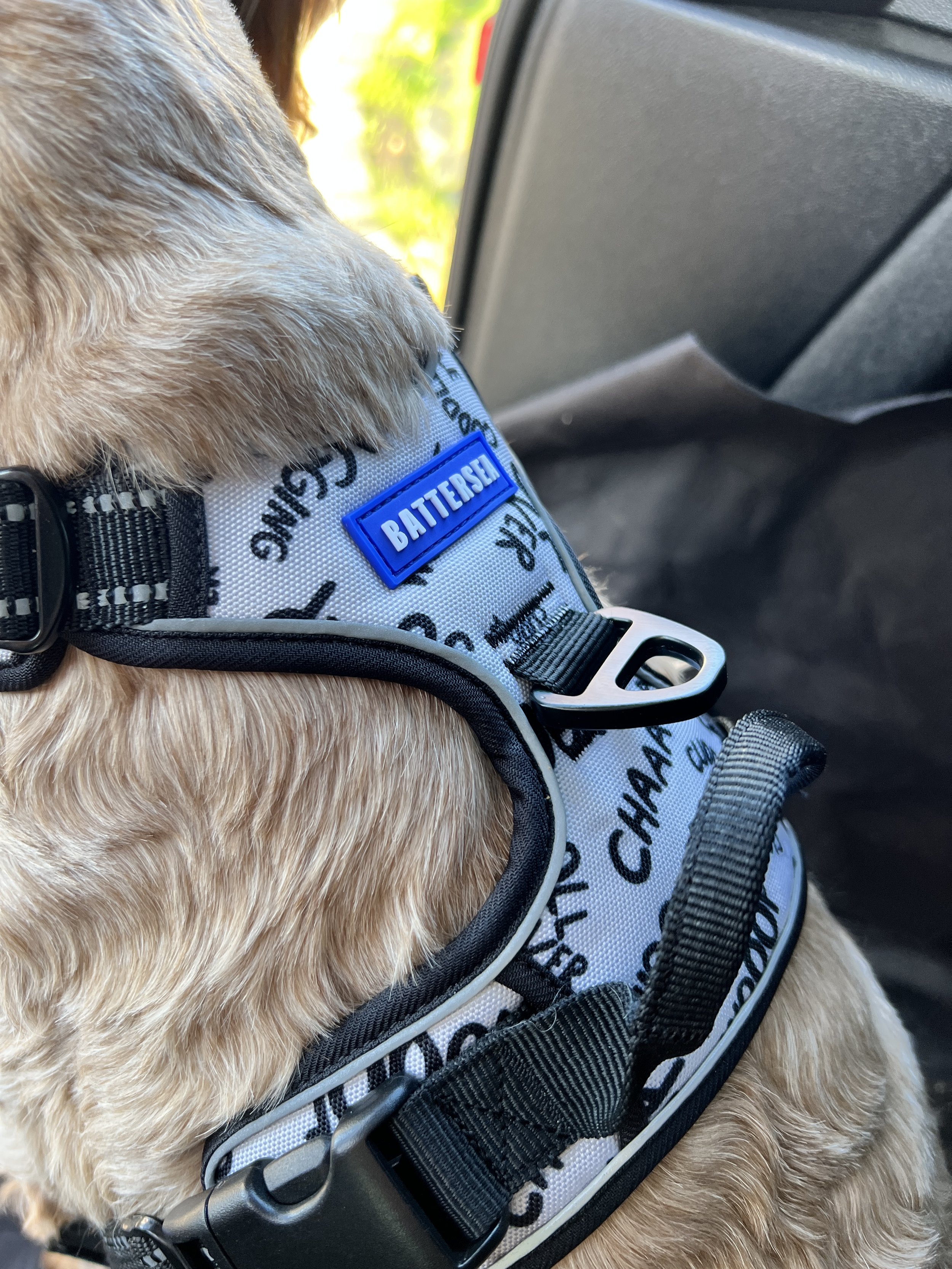
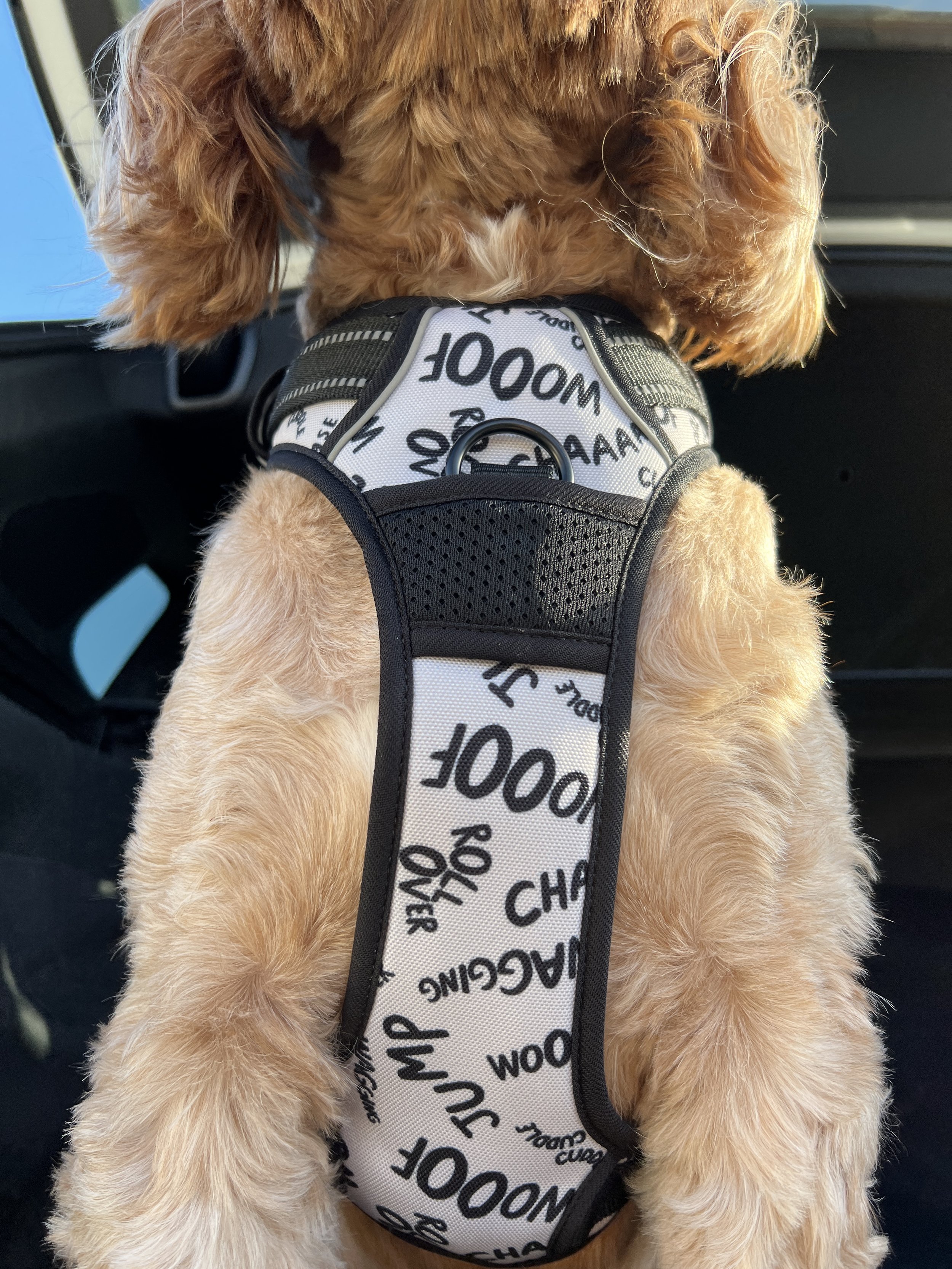
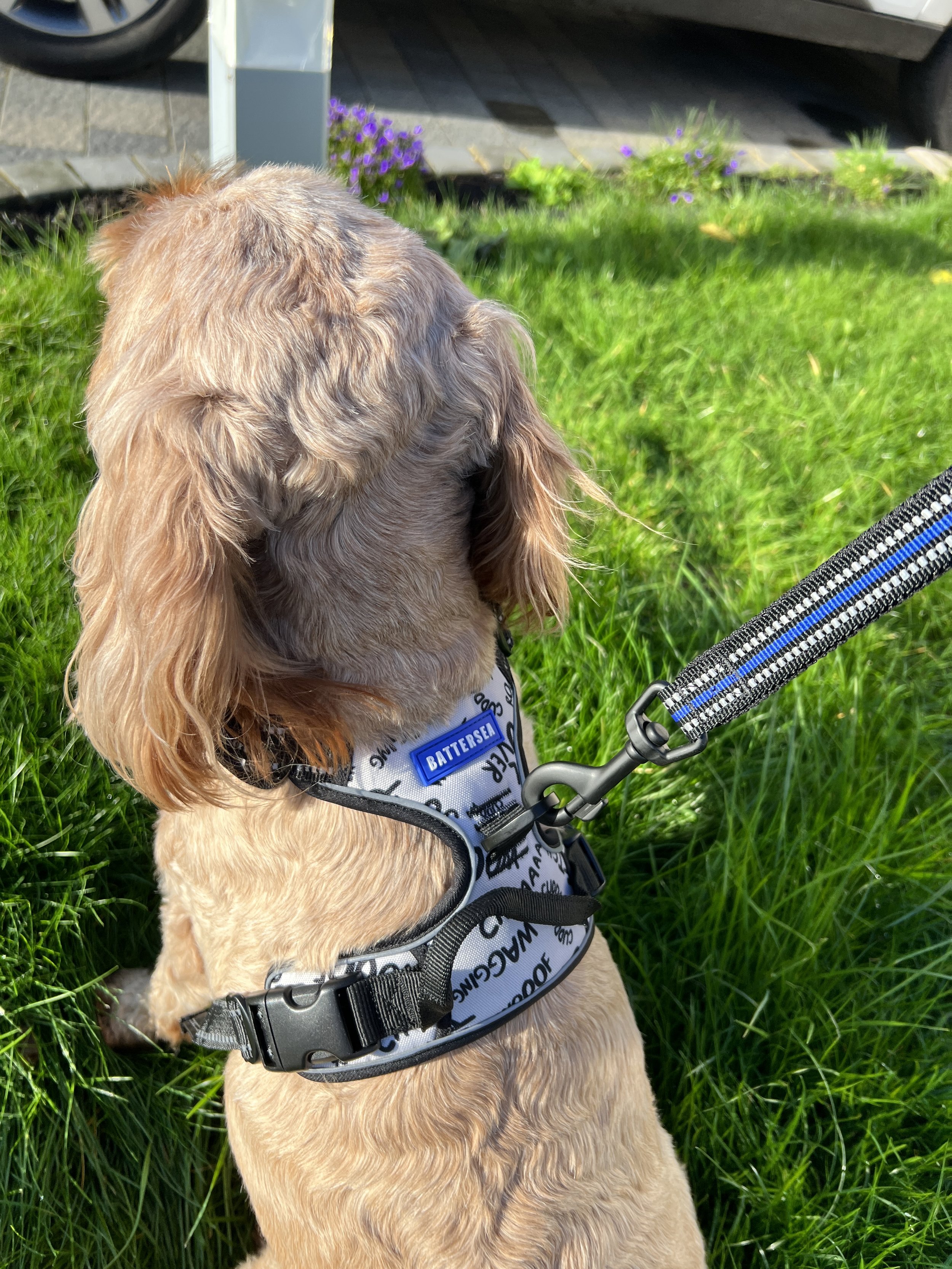
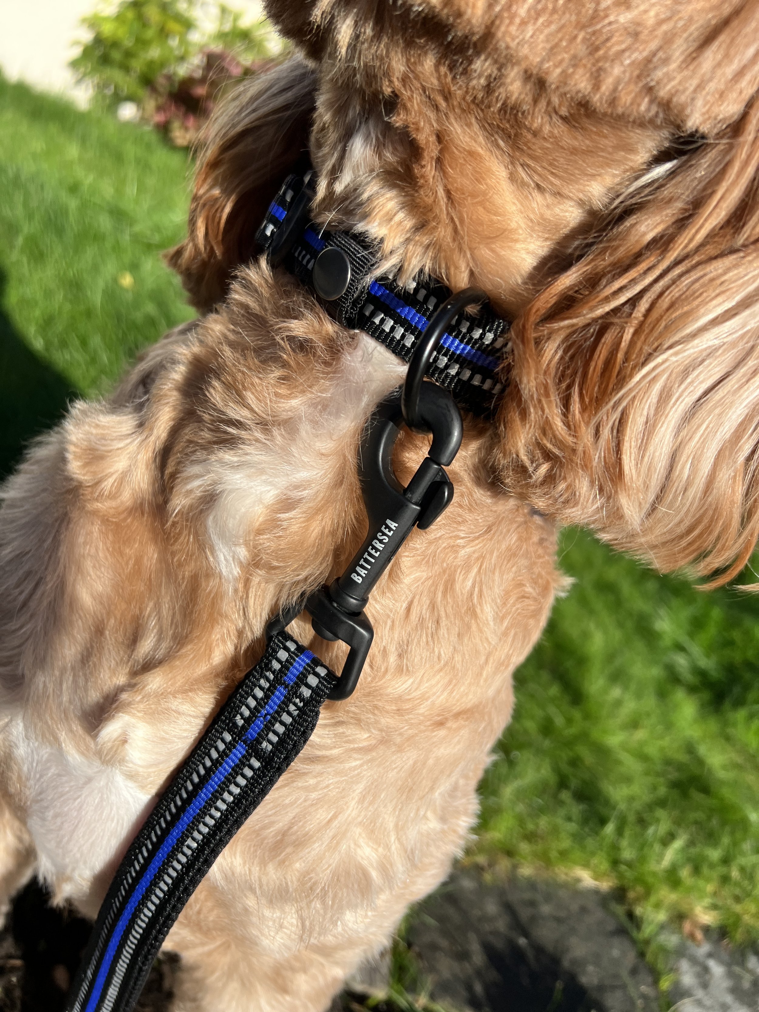
Dog Harness - I learned quite quickly, after seeing samples of this product, that there was not much area to work with and that due to the production method on the way the fabric was printed, that having an illustration or statement would of had inconsistencies with placement on each panel. This product also came in sizes XS-XL so had varying area sizes. One of the patterns provided by Battersea was a typographic piece, that had wording in all different angles and positions, which after testing and playing around with scale, proved effective. All that was left to do was try a combination of colours to be shortlisted and add some Battersea branding, rather than adding the Battersea logo to the print which would of appeared flat, I opted for a rubber moulded logo to be sewn in, which really added an extra layer of quality to the product, whilst keeping that strong brand presence.


Dog Poop Bag - This product was small in size but had enough room to use one of the statement elements provided by Battersea on the main panel, it also meant that we were sticking with the typographic theme as selected on the other products. The main issue I faced, was choosing a colour that was neutral enough for any gender to pick up, taking into consideration that this product was wearable. I also wanted to factor in that this was a product to be used outside and had the potential to become dirty during everyday use, so lighter colours were best avoided. Above is a vast selection of colour variants I produced applied to both the product and statement on the side panel. In addition to this I applied the Battersea logo to a fabric tab to give the product a strong brand presence. A metal moulded zip pull would also be made using one of the brands statements “Here for every dog and cat” giving the product a quality feel.
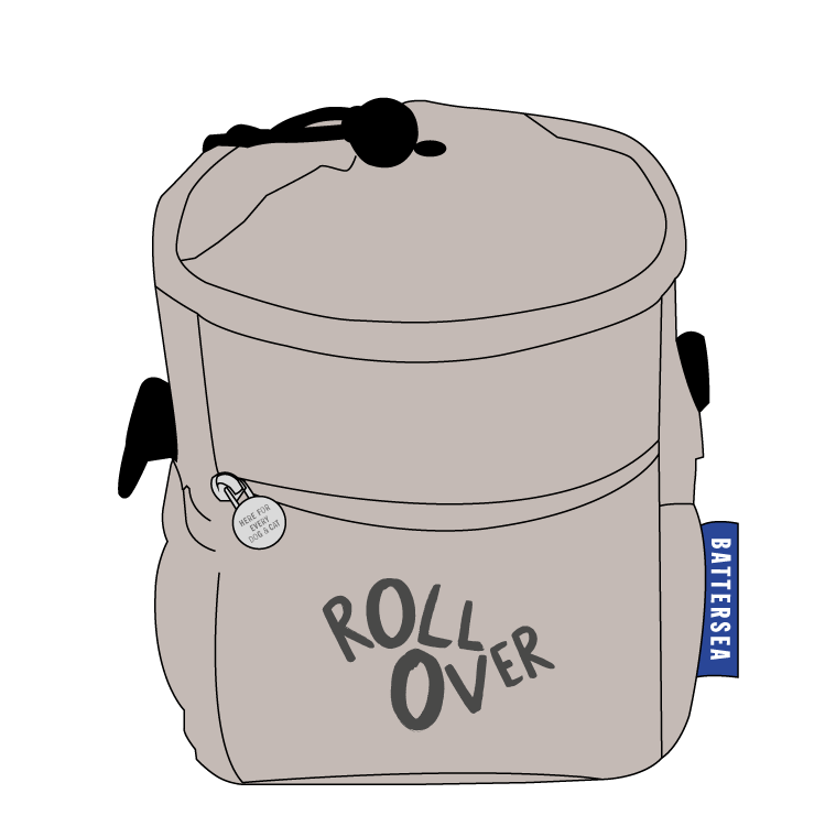
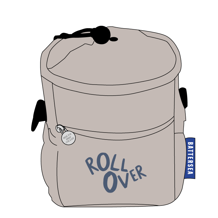
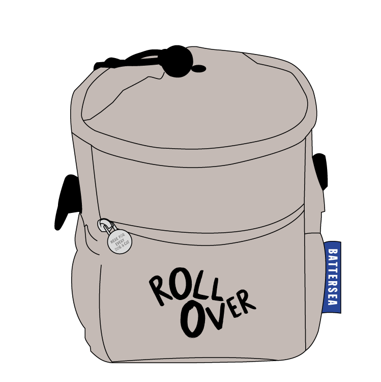
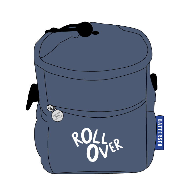
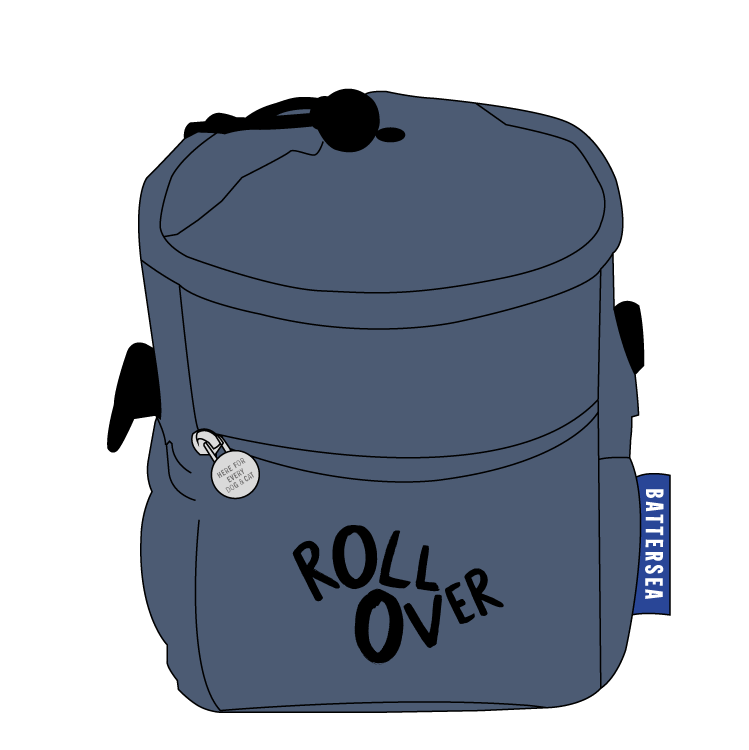
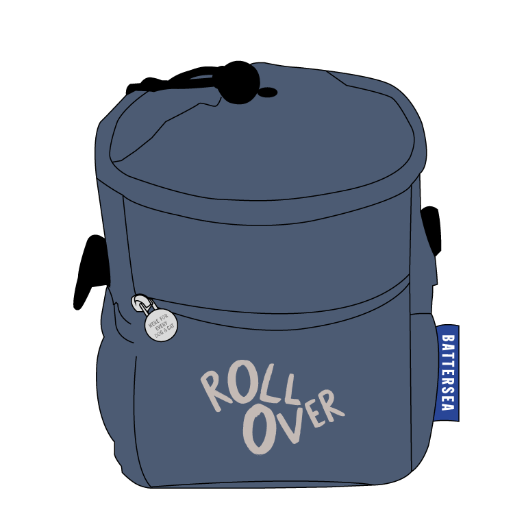
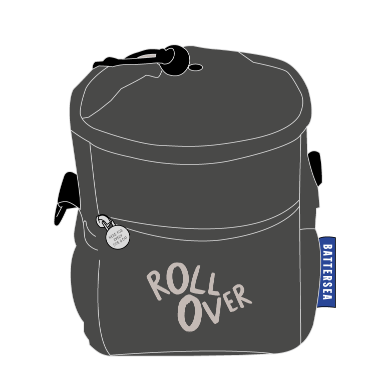
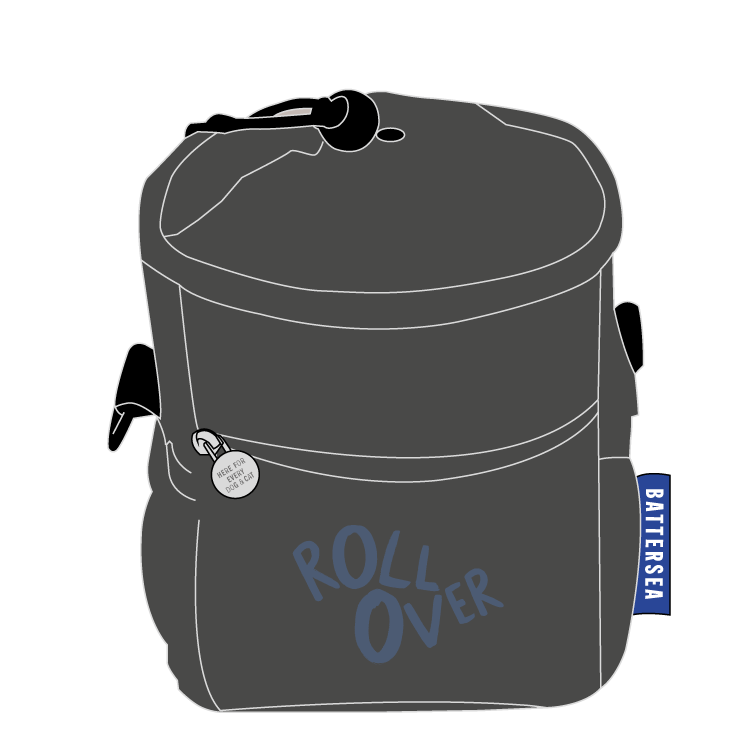
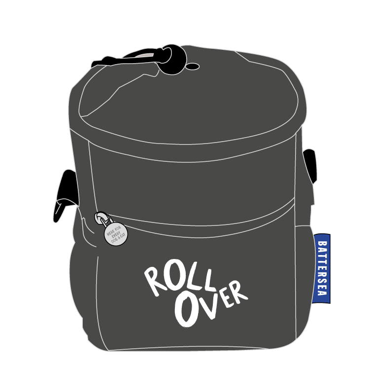
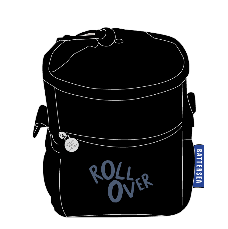
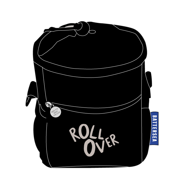
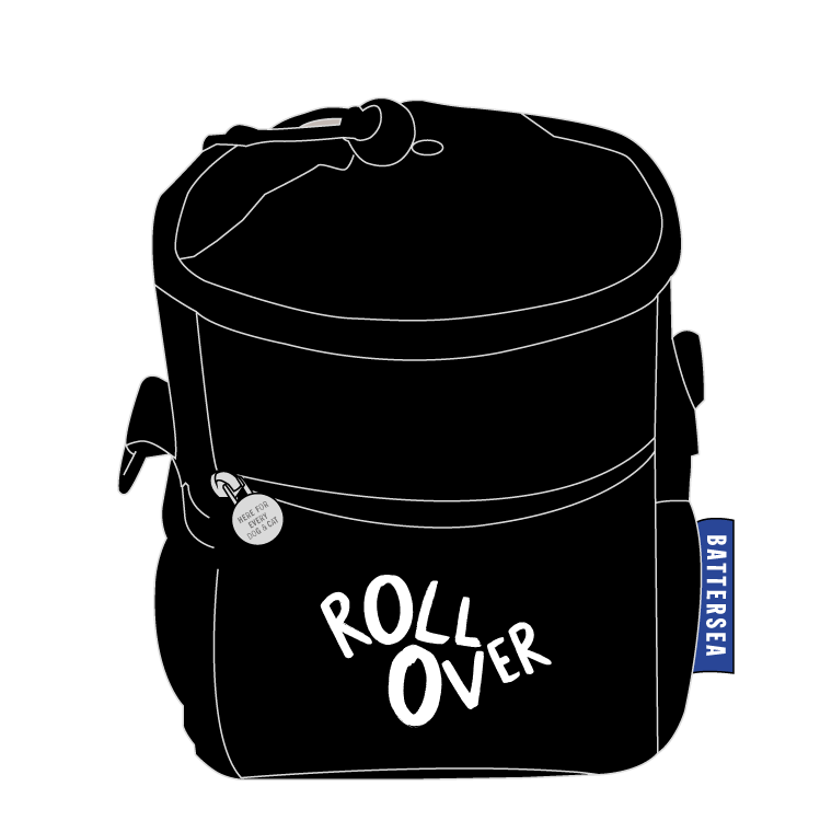
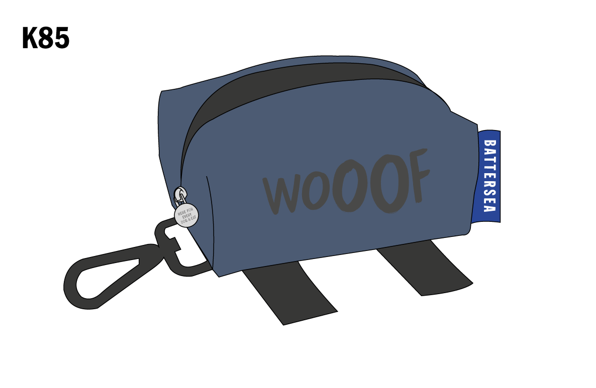
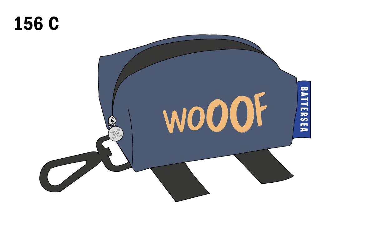
Treat Bag - This product had similar considerations to the Dog Poop Bag as it was another wearable piece to be used outside. Sticking with the typographic theme I chose the “Roll Over” statement as dog owners often reward their dog with a treat after behaving or doing a trick.
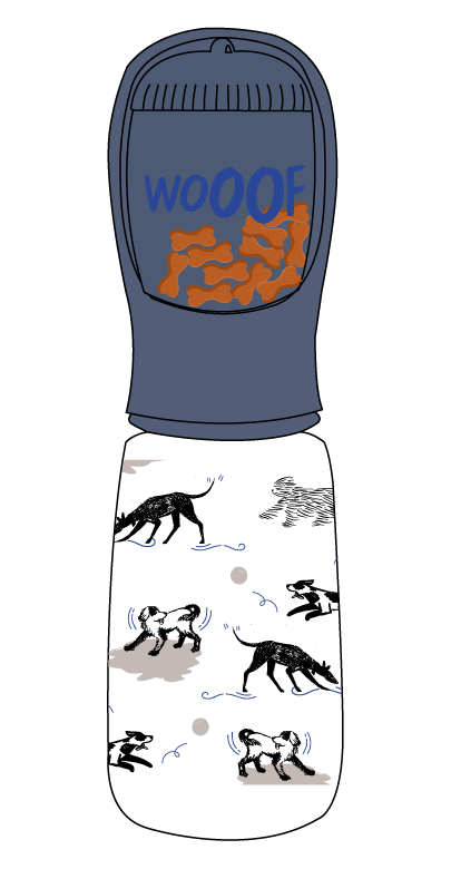
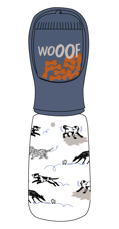
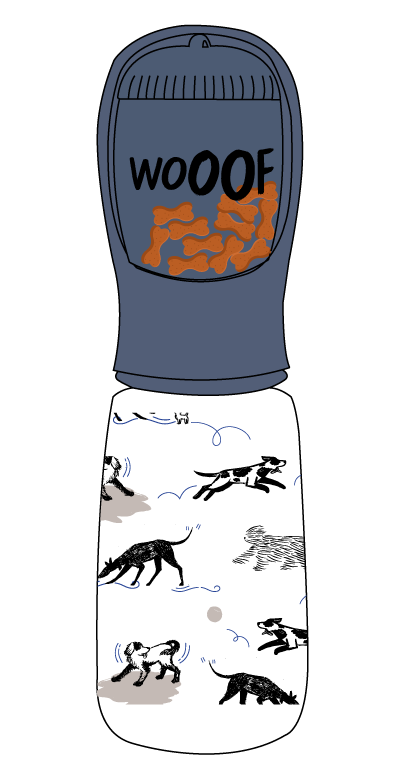
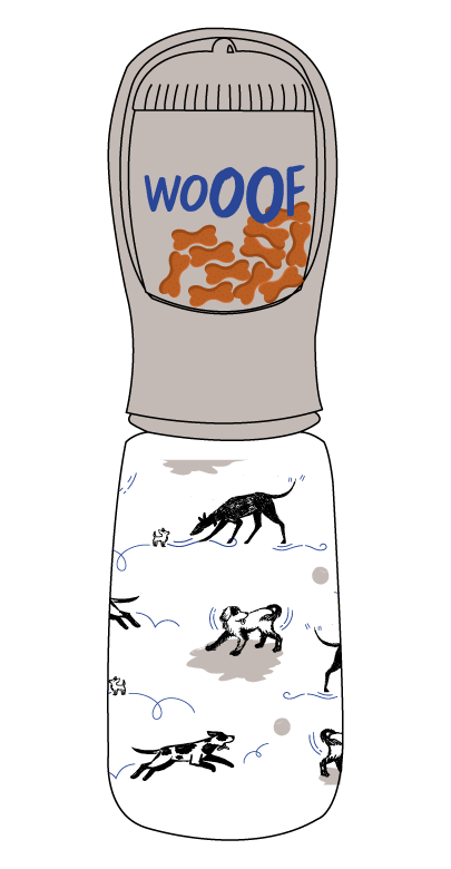
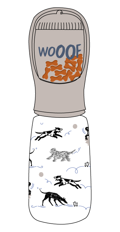
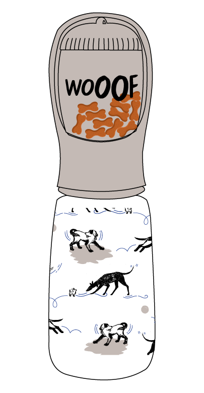
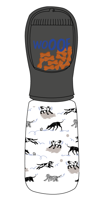
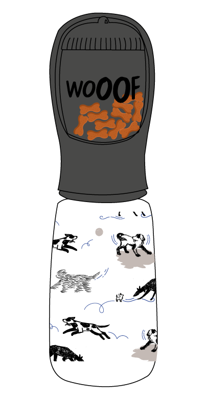
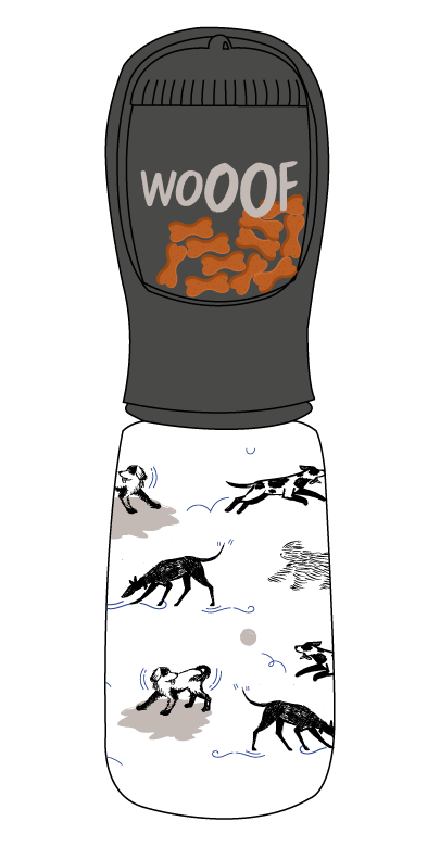
Water Bottle/Treat Cup - For this product I wanted to make use of both a typographic statement and also an all over wrap featuring dog illustrations. The pattern I chose had multiple dog breeds rather than sticking to a pattern with just one breed, I feared this might have a negative impact on the customers buying choice if it was just a single breed. This product had a late design change with the brand approval team and ended up featuring the Battersea logo on the treat cup and not the “Wooof” statement.
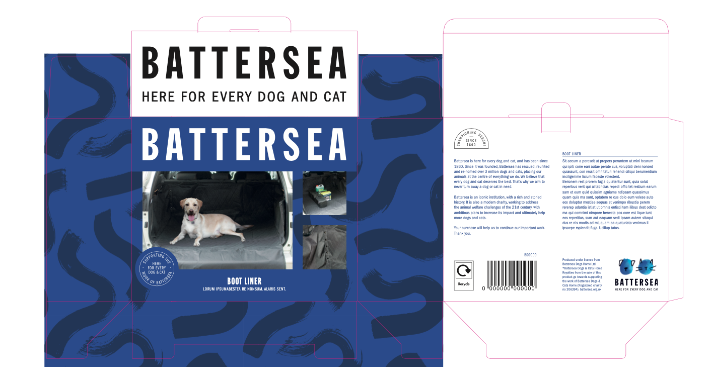

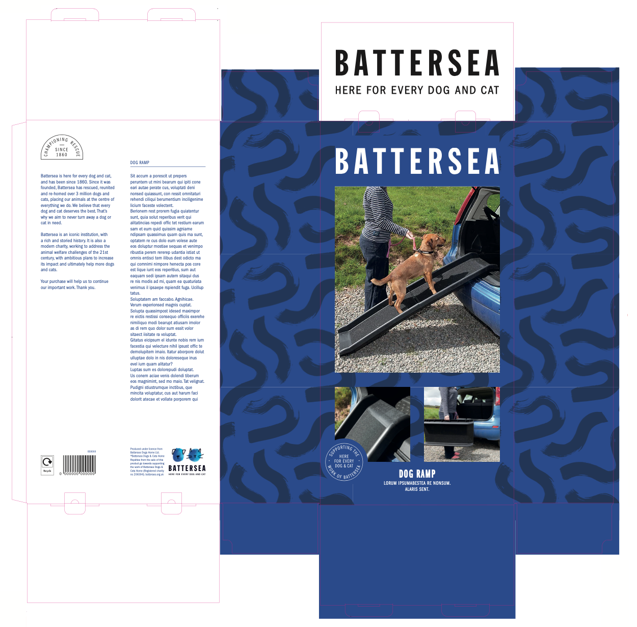

Above I have featured some very early packaging concepts, this was for us to do an early colour test with suppliers and also for me to see the size and scale of the elements on the packaging. The packaging varied from boxes, backing cards, hang tags and eurohook hangs. The images used on the packaging above were placeholders, along with placeholder text and mockup barcodes. I hope to update this page next year to feature the final product and packaging designs.